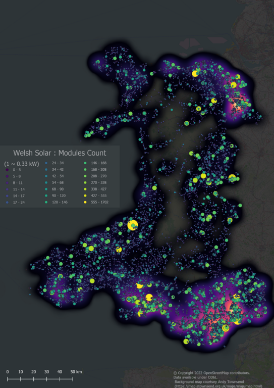
Well over a year ago I extracted all the amenity=pub objects for Great Britain. Nearly 860 keys are used across all the elements. I’ve spent some time delving into these keys, trying to classify them, and hopefully learn a bit about two things: the kinds of information people want to know about pubs; and why synonyms exist for certain keys and tags. I’ve been prompted by SomeoneElse’s list of building tags.
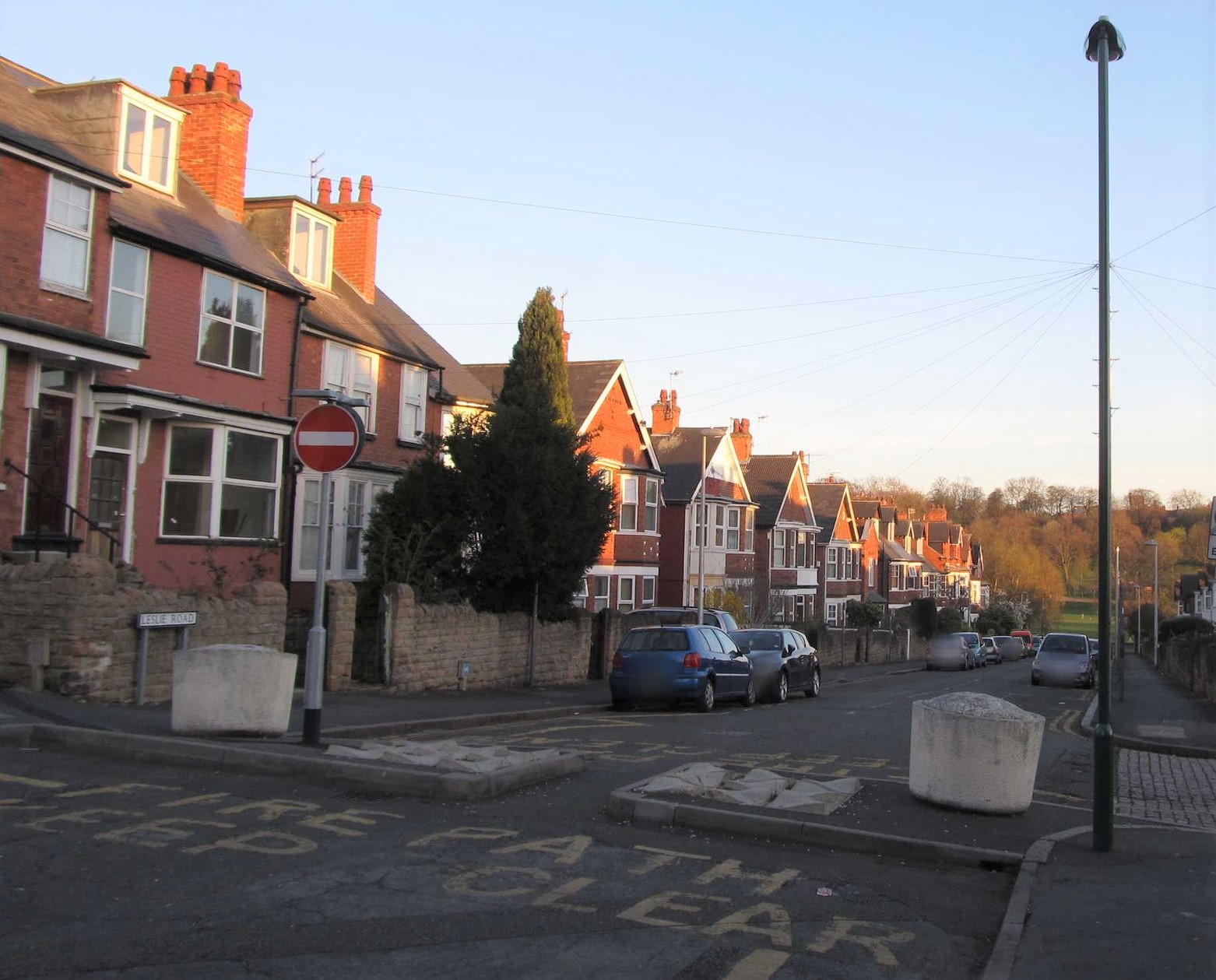
 A pub which I recently edited on OSM adding
 real_fire=yes.


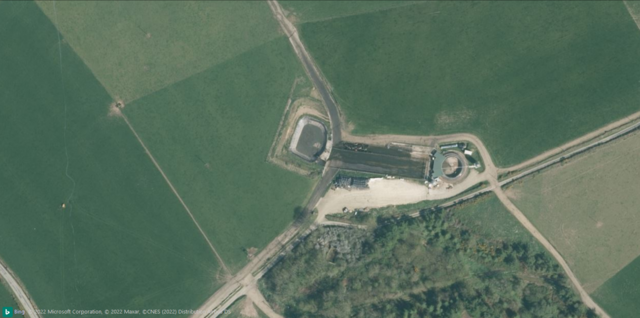 Bing Imagery (close-up view).
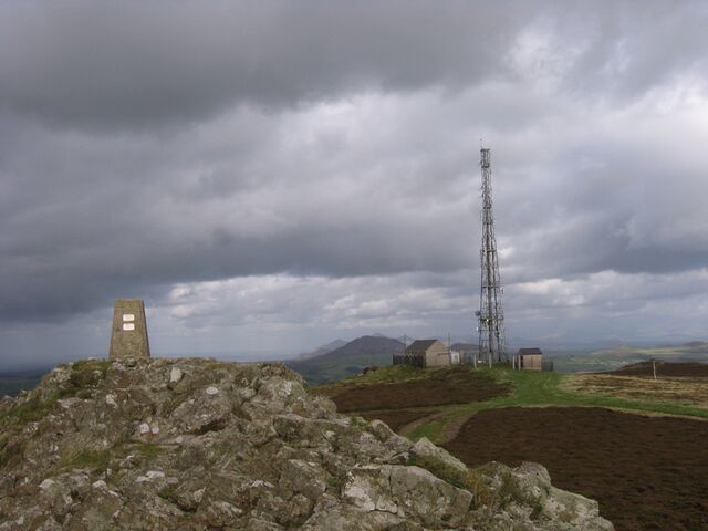 Summit of Mynydd Rhiw
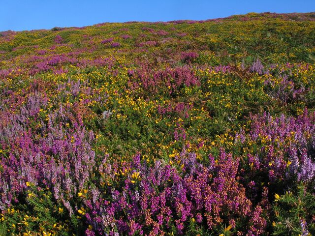 Colourful late summer heath at South Stack