Unknown Pleasures (of humanitarian mapping)
Posted by dekstop on 5 November 2015 in English. Last updated on 6 November 2015.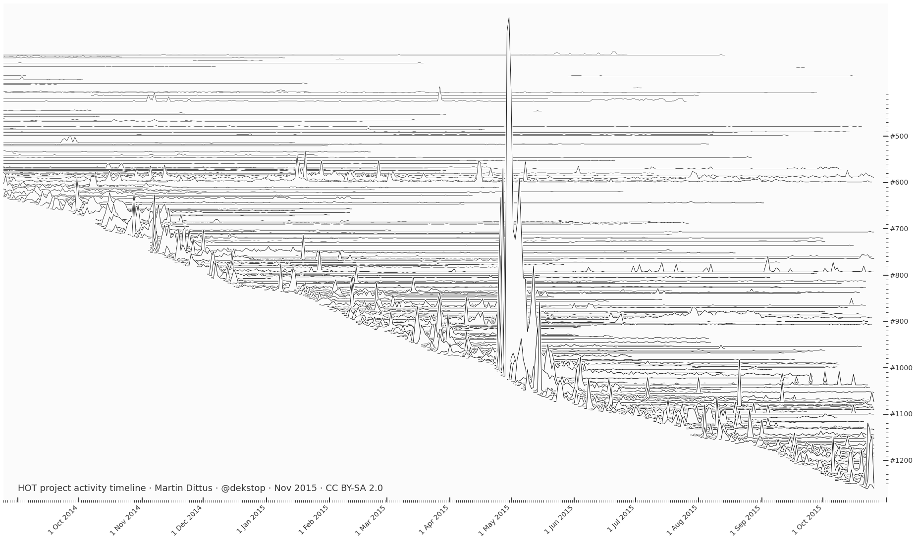
Harold D. Craft’s classic visualisation technique applied to a timeline of HOT project activity. As previewed before and used in the Missing Maps review, but updated for early November 2015. Click through for the full version.
A line per tasking manager project, its height along the implied z-axis is proportional to the number of project contributors on the respective date. Projects tend to be most active in the beginning, and then activity tails off. However some large projects are eternally active… MapLesotho (#597/599) is among these, partially covering the equally long-running South Sudan (#591). Remarkable how massive the Nepal contributor community actually was, in the scheme of things – the big spike in the centre would be even taller if the work hadn’t been spread across multiple projects (between #994 and #1090).
There’s also a PDF version if you want to print it out.
If it looks fuzzy on your screen then make sure you’re looking at the image in its native resolution: open it in a new tab and zoom to 100%. At an information density of several hundred high-contrast lines within just a few inches of digital display space it’s hard to avoid moiré effects. The preview you’re seeing above is optimised for smaller display sizes… It’s still not great.
Discussion
Comment from Harry Wood on 16 November 2015 at 16:45
It’s “image of the week this” week! osm.wiki/Main_Page