
Experimenting with OpenStreetMap Data History Visualization using GPT-4
Posted by darkonus on 21 April 2023 in English.OpenStreetMap (OSM) is an invaluable resource for geospatial data, providing free and open access to information about our planet. One interesting aspect of OSM is its ability to track the history of changes made to objects in its database. As someone curious about geospatial data, I’ve been exploring ways to visualize this data in a more intuitive manner. Recently, I decided to experiment with GPT-4, a state-of-the-art language model by OpenAI, to see if we could come up with a fresh approach to visualizing OSM data history. In this blog post, I’ll share my initial attempts, examples of the traditional OSM Deep History table, and the new visualization I created with GPT-4’s assistance.
Traditional OSM Deep History Table
The standard OSM Deep History page presents data history in a tabular format. While it’s a helpful tool for understanding how objects in the database have evolved, the table format can make it difficult to quickly grasp changes and trends in the data. The table includes a row for each version of the object, with columns for different attributes. As a result, finding meaningful insights can be challenging.
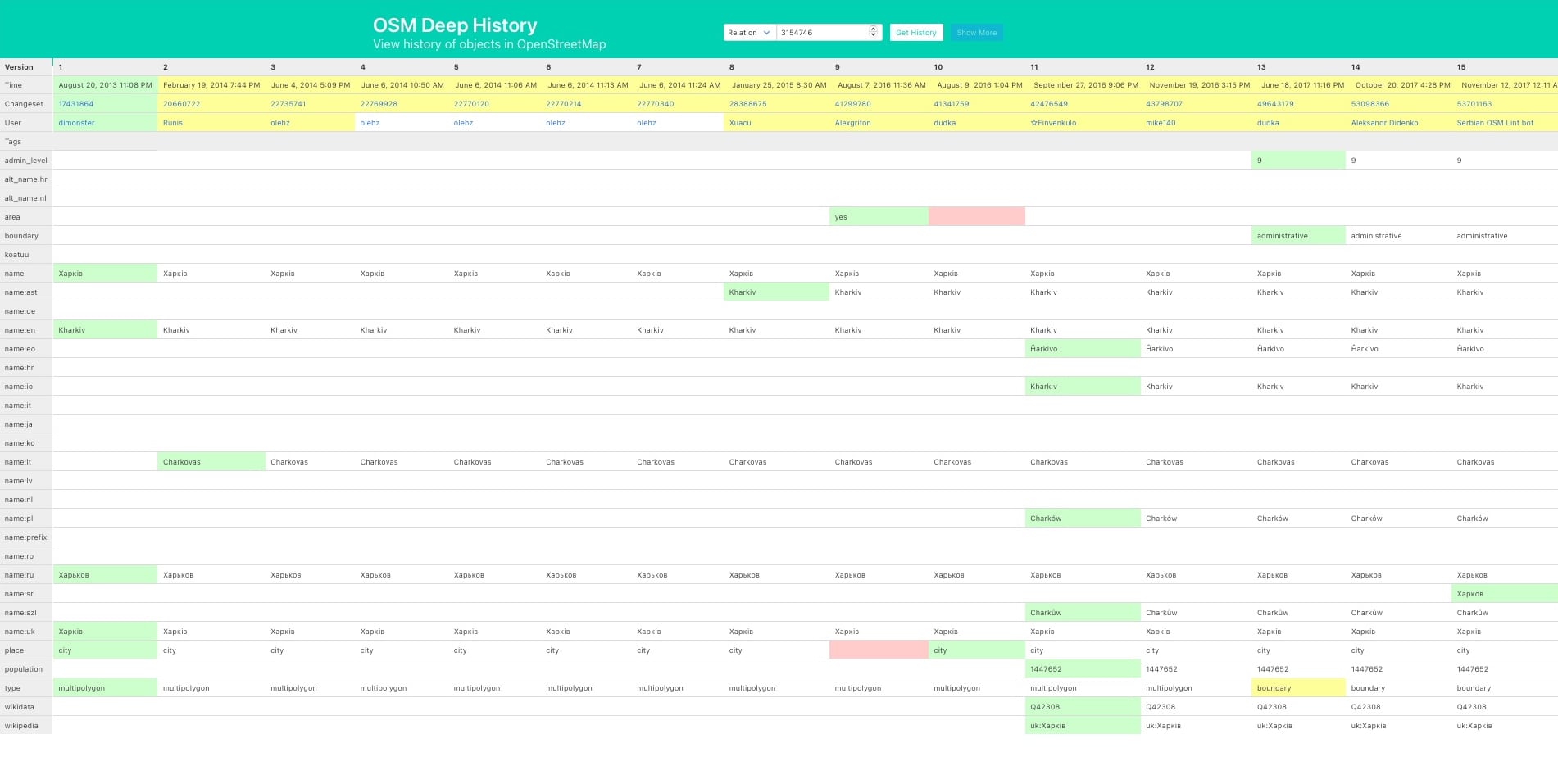
Figure 1: The traditional OSM Deep History table displaying object history in a linear format.
Experimenting with GPT-4
To create a more visually appealing and intuitive representation of data history, I decided to experiment with GPT-4. Together, we developed a new approach to visualizing OSM data history using an enhanced table format ಠ_ಠ in the browser. This new visualization prioritizes the most recent changes, sorts the columns based on the order in which the keys first appeared, and clearly highlights additions, deletions, and modifications to the data.
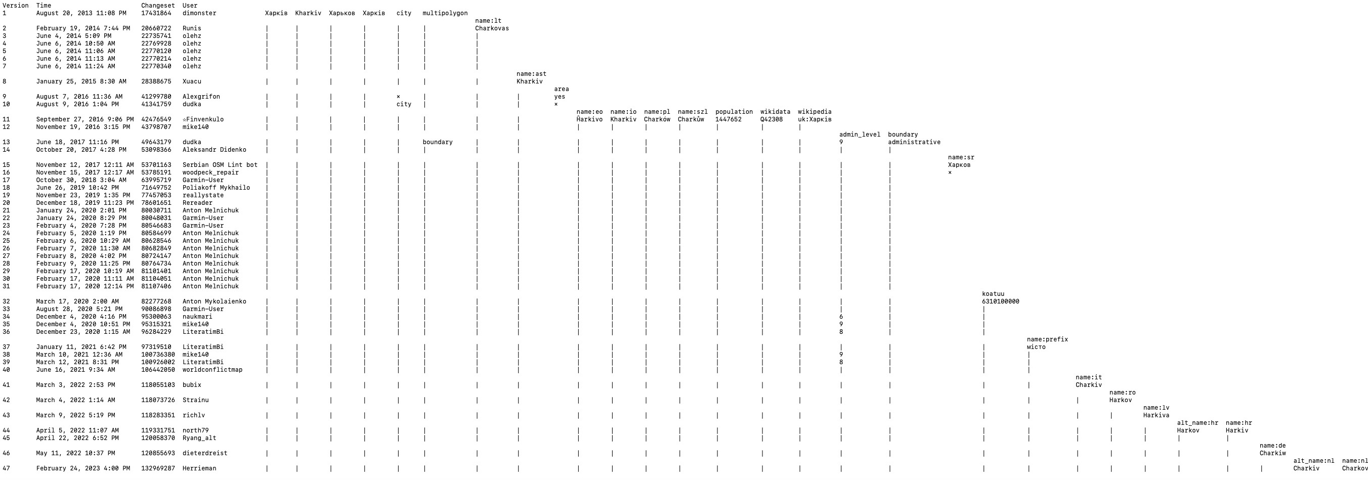
Figure 2: The experimental visualization created with GPT-4 assistance, organizing the data more effectively and emphasizing important changes.
Illustration Comparison
The traditional OSM Deep History table displays the data linearly, making it difficult to quickly identify changes and trends. In contrast, the experimental visualization enhances the presentation by organizing the data more effectively and emphasizing the most important changes. This helps users more easily understand the evolution of the object and gain deeper insights into its history.
Conclusion
My initial experiments with GPT-4 to visualize OSM data history have been an interesting learning experience. These are just my first attempts at data visualization. If you’ve come across any such examples or have ideas for other applications, please feel free to share them in the comments below.
Discussion
Comment from (inactive) WarpathPeacock on 1 May 2023 at 12:18
Can you share your methodology for working with GPT-4 to create this more intuitive representation?
Comment from darkonus on 1 May 2023 at 12:33
WarpathPeacock, I asked him to write a simple website with index.html, styles.css, and scripts.js files. The script would take data from the data.js file and generate a table. After that, I would describe my ideas to him in plain language and he would correct the code that would display the table. Eventually, we came up with this result. It took us half a day. That’s all :)
Comment from rene78 on 2 May 2023 at 08:47
I personally find the old visualisation easier to understand, to be honest. Great idea to use Chatgpt to accelerate development though!