OSM Contributors Outlook - The Pulse of OpenStreetMap Contributors
Posted by PierZen on 11 October 2017 in English. Last updated on 16 November 2021.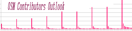 Talking of the OSM Contributors, we often see the Big Numbers. In this Diary, my objective is to focus on the OSM Contributor profiles, to try to measure the impact of various groups on the OSM Edit Contributions.
Since 2005, there has been an explosive growth of new OSM Registered members from 500,000 in 2012 to 1 million in 2013 and 4.2 millions at the end of september 2017.
Pascal Neis and Alexander Zipf study in 2012 showed that only 38% of the registered members at the end of 2011 had started editing the database and that only 5% (24,000) of all members actively contributed to the project in a more productive way.
Activityworkshop.ne published in july 2013 an interesting analysis of contributors «Joining and leaving» as participants. It shows the volatily of OSM contributors with a high volume of contributors starting and stopping contribution shortly after. As we will see below, a high percentage of people that start to contribute stop the first day or after a short period.
There are also various studies that show the contribution inequality with most of the data produced by a minority (see Anran Yang, Hongchao Fan, Alexander Zipf, 2016 and Ding Ma, Mats Sandberg and Bin Jiang, 2015). Statistics and analysis presented by Pascal Neis and Simon Poole over the last years did also show various aspects of the contributions, with the concentration of Contributions by a minority and the volatility of contributors participation.
The OSM Changesets Dump File contains metadata about each changeset edition. Like others, our analysis comes from this file. If we dig in and analyze the OSM changesets database, this shows that for the 13 years from 2004 to end of september 2017, 953,200 contributors edited at least one object and 108,800 edited more then 1,000 objects (ie. node, ways or relations). This is an indication that there are massive inflows of new participants that contribute minimally. The analysis below will confirm this hypothesis.
The Pulse of OpenStreetMap Contributors
Cohort analysis let’s break a dataset into related groups that share common characteristics or experiences. For OSM, we can group contributors by the year they started to contribute and compare the various cohorts to see patterns of contribution.
The graph 1 reveals what I call the «Pulse of OpenStreetMap Contributors». Rodolphe Quiedeville OSMPulse website did also illustrate the beat of contributions. While his real-time graphs (Last update in 2014) did focus on the number of objects edited minutely, we focus on the contributors with the same year of experience. For each calendar year, this is like if we did organize a marathon will all the contributors aligned on the same start line, looking at their progression month by month. We could also follow them for even longer periods and compare their long term behavior.
Graph 1
Note that this graph do not show a long timeserie. These are
individual graphs for each yearly cohort.  For each year,
we follow for 12 months the new contributors that start editing.
Here for each calendar year, we follow OSM new contributors and participation from their month 1 to month 12 of contribution (it does not matter if one started in january, feb. etc). With such cohort analysis, we can see all the new entries for the year. This reveals what I call the Pulse of «Discovery contributors» with the great majority that do not participate more then 1 month. The high rate of departure at month 1 confirms the volatility of contributors participation. It shows what is called the lower tail of Contribution with a high number of Contributors with a minimal impact on the OSM edits. There is a lot more to say from such analysis and I will come back in an other Diary with more profile analysis from the cohort trajectory statistics.
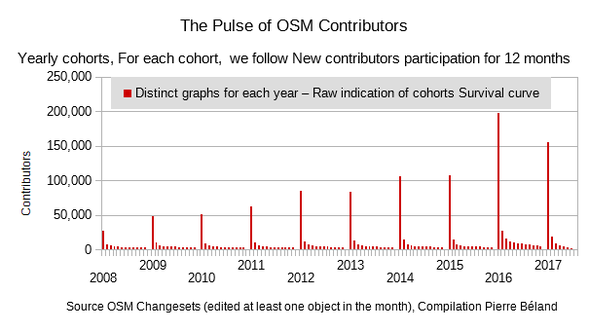
Simon Poole published in his OSM Diary various examples that show the variability of inflows of new contributors and how it is not always related to significative edits. The sudden increase of contributors in early 2016 that we can observe on graph 2 below comes from Maps.Me editors where many of them did map personal infos. At the end of 2016, thousand of faked accounts were created in USA by SEO companies. OSMstat for 2017-09-30 shows also indications of various profiles with 5,413 active contributors and 3,301 with node edits > 15.
Graph 2

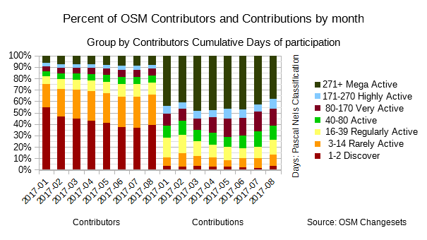
Monthly Statistics – Let’s color with Contributors Profiles
Lets’ now add Days profiles to the monthly statistics and help better see the heterogeneity between the Contributors and the Contributions. Pascal Neis OSMstat website and Simon Poole stats on the OSM wiki OSM wiki let us observe monthly statistics of contributions. We observe since the beginning of 2016 an average of 25,000 to 50,000 active contributors per month.
Graph 2 combines the monthly statistics of Contributors (ie. have edited in the month) and Contributions (ie. number of objects edited node, way or relation) from the OSM stats wiki. We color these charts with the Contributors profiles based on cumulated days of participation since the first edit to OSM (Pascal Neis classification). The comparison of the two graphs let’s observe the concentration of Contributors in the first two classes and the concentration of the Contribution in the last class.
Profiles of Contributors and Contributions by month for 2017 up to september on Graph 3 let’s measure the respective percentage of each class based the cumulatives days of contribution. For 2017-08, the first two classes «Discover 1-2 days» (19,186 contributors) and «Rarely Active 3-14 days» (12,845 contributors) represent 66% of the share of Contributors. In comparison, their share of Contributions (13%) is relatively minimal. The «Discover» class with 3.5% of Contributors corresponds more or less to the «Pulse» we observe on the cohort analysis.
The other tail of distribution is represented by the 4,000 contributors that are part of the «Mega Active» class (271 days and more). They represent 8% of Contributors and 37.6% of Contributions.
Graph3
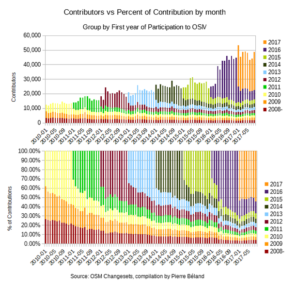
Pascal Neis Contributions of the yearly cohorts graph on his 2016 yearly Statistic Blog, shows the respective importance of each yearly cohort on the level of monthly Contributors. In this case, the cohorts are not aligned from month 1 but colors let’s see stratas of contributors by the year they started to edit. With this representation, the peak of the yearly new contributors is less acute, being spread in the month they started editing. The top of Graph 4 reproduces Pascal chart. Every year, we observe the jump in the number of contributors, and their relative importance that reduce gradually in the next years. Again, we see the rise of Contributors from 2016.
The Contributions Profile at the bottom of the Graph (ie.Percentage of Contributions by months) reveals that the first year of participation, the yearly cohort of new contributors represents nearly 40% of contributions, that share reducing in the following years. With the rise of Contributors in 2016 and 2017, we observe also a rise in the share of Contributions. Simon has measured that the rise of Maps.Me Contributors had a minimal impact on the share of Contributions. More analysis will be necessary to explain which categories are responsible of this jump.
Graph 4
I hope that this different angle on the Contributors data will hep to better understand the various contributions to OSM. Do not hesitate to comment. And I plan to continue such analysis in other Diaries.
Discussion
Comment from imagico on 11 October 2017 at 09:18
Some interesting observations can be made from these diagrams but i also find two things somewhat misleading.
First Graph 1 looks wrong since the x-axis looks like a time axis but in fact is not - as i understand this it is a combination of separate diagrams for every year with the x-axis indicating the month after first contribution.
Second considering the days of participation a measure of activity is problematic. In particular the very active weekend mapper mapping a lot during the whole day on weekends will have a lot less days of participation than the casual end-of-day mapper who maps a few things every evening to relax.
Is it just my impression or does Graph 4a indicate that contributions from veteran mappers (who started mapping several years ago) has increased quite a bit in 2017?
Comment from PierZen on 11 October 2017 at 12:51
Thanks for your comment,
You are right, Graph 1 is in fact a serie of graphs sticked together. And yes, it could be confusing if interpreted as a long timeserie. I show only 12 months, but I could have a longer period for each graph. By placing these graphs side by side, it let you compare behavior from year to year. We could also group data for longer periods. I amended the text with a note on this serie of graphs.
We often see statistics of big numbers like the new entries every year. Here we can see for month 1 of earch yearly cohort these entries, and follow the contributor’s behavior in the months that follow. We see that there is a constant behavior from year to year.
It let’s observe a Pareto distribution that some also call the Long tail distribution. It let’s us observe survival functions from month 1 of the contribution.
Comment from PierZen on 11 October 2017 at 13:13
Second point, the days of participation is one of the measure of Intensity of contribution. While I consider it better then the number of changesets, it is exact that it cannot take account of all the contribution profiles. Analysing these statistics of contribution, we see that averages do not worth much with outliers being more the norm.
What type of synthetic indicator of intensity other then the cumulative number of Contributions could explain intensity of contribution? There is a great variety of behaviors, with more or less days of participation and more or less volume of edits per day.
Comment from PierZen on 11 October 2017 at 18:38
VS Graph 4a contributions, we observe a constant fluctuation of new contributors with an increae at the end of every year. At the same time, there is a significative retention of veterans after the first years of contribution. The table below shows the average contributors by year for each yearly cohort. I also added for each year of contribution the share in % of veterans. Has we see, their share decreased in 2016-2017 with the increase of new contributors. The impact on Total contribution, this is an other story.
Contributors, Monthly average of participation by year All Veterans Veterans Year Contributors in % of year 2010 13,059 6,598 50.5% 2011 16,003 8,531 53.3% 2012 20,078 10,182 50.7% 2013 21,594 11,857 54.9% 2014 25,322 13,506 53.3% 2015 27,048 15,176 56.1% 2016 38,357 16,393 42.7% 2017 47,486 22,839 48.1%
Comment from PierZen on 11 October 2017 at 18:45
Table formatted
Contributors, Monthly average of participation by year
Comment from putnik on 11 October 2017 at 20:09
PierZen, could I ask you to publish the raw data on which the graphs were built?
Comment from PierZen on 11 October 2017 at 22:35
I uploaded the tables on Github since it has minimal Markdown table formatting that OSM Diary do not recognize.
See https://github.com/pierzen/OsmContributorStats-Changesets/blob/master/Pulse_of_OpenStreetMap_Contributors_2017-10-11
Comment from velmyshanovnyi on 12 October 2017 at 01:43
https://gaming.youtube.com/watch?v=2-lcp4p20OY Pulse
Comment from velmyshanovnyi on 12 October 2017 at 01:43
PULSE Mapping - OpenStreetMap - OSM
http://live.openstreetmap.fr
Comment from pisang coklat on 14 October 2017 at 05:54
Thank you for sharing interesting information PISANGCOKLAT