Crediting OSM - A Logo Story
Posted by LySioS on 5 October 2021 in English. Last updated on 6 October 2021.Disclaimer #1 I’m not used to speak english anymore, I apologize if some sentences sound clunky.
Disclaimer #2 Last time I added pictures in the diary post, they would not always show up. Click on the link if it happens.
Introduction
So now, I’d like to start with a provocative joke :
Marck Zuck. comes into his office and asks his colleagues :
– Hey, do you know why there’s a magnifying glass on the OpenStreetMap logo ?
– Well, it means that OpenStreetMap helps you find places and amenities on the map.
– Not a all ! It’s because you won’t notice the credits without one.
Text Vs Logo
My point is that OpenStreetMap lacks a strong visual identity. I believe I started to notice it when I read some Facebook employee saying that a logo would be easier to credit on a map than the (c) openstreetmap contributors. 🤨
Dishonesty aside, he makes a point. The (not so) new OSM logo is gorgeous and deserve more consideration and would help OSM maps being more recognizable and popular. In times where we are constantly facing pictures, logos, visuals, a brand/company/project/whatever need a clear visual identity to exist in our digital world. The actual text only credit looks like good oldies websites.
Besides, sometimes, OSM credit is in competition with some other logo. I was thinking of Mapbox but I couldn’t find an example with an OpenStreetMap map.
 a fair credit between the two projects
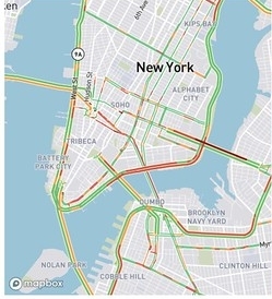 the logo will draw attention and outshine osm text credit
To me, OSM should definitely impose the logo as a way of crediting.
Mock-ups
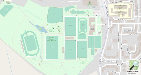
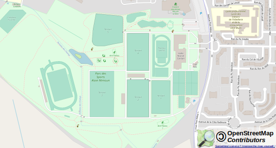
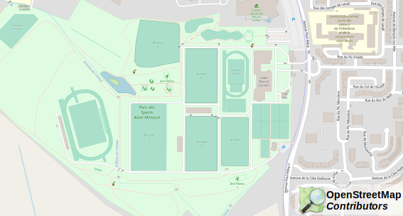
I came to wonder how it’d look like to embed the logo on a map. Here is some mock-ups.
 http://lysios.free.fr/osm/blog/attribution/mockup1.png
 http://lysios.free.fr/osm/blog/attribution/mockup2.png
 http://lysios.free.fr/osm/blog/attribution/mockup3.png
 http://lysios.free.fr/osm/blog/attribution/mockup4.png
 http://lysios.free.fr/osm/blog/attribution/mockup5.png
 http://lysios.free.fr/osm/blog/attribution/mockup6.png
 http://lysios.free.fr/osm/blog/attribution/mockup7.png
Some thoughts
My preference goes to number 3. Several reasons :
- The word contributor appears and give the idea this map is collaborative and credits all the little ants that survey the world.
- The copyleft symbol 🄯 is important. If we, builders of the free world do not promote this way of thinking, who else will ?
- a small text Digital Commons. Improve the map for all’s benefit linking to https://learnosm.org/en/beginner/start-osm/ to bring forth the openness of OSM and lead newcomers.
Note about the copyleft symbol. I’ve been told that it would be complicated to use because it is not well rendered by unicode yet. To me, it is not a problem if you make the credit a .svg logo.
The problem, though, is that it takes some place. Too much ? One cannot complain that text-only attribution is discrete. Maybe we could fix this : (click to open the svg version and click to unfold the logo)
-
Small

-
Standard


Facebook and the others
Let’s resolve Facebook issue :
- Current small map
-
fixed

- Current big map
- fixed
Easy Peasy
What do you think ?
Discussion
Comment from tyr_asd on 6 October 2021 at 10:15
For reference: A similar proposal had been brought up in 2013. It was discussed mostly on the osm talk mailing list, as well as on github and in at least one meeting of the OSMF License Working Group.
Comment from LySioS on 6 October 2021 at 21:13
Thanks for the background history.
It’s very interesting to see that the idea to emphasize visual identity for the attribution was well received back then.
Except for the inconsistency between the “by osm” and the original logo, plus the lack of the mention “Contributors”, I couldn’t find a clear statement why this idea was dropped or didn’t fulfill.
Do you know ?
Comment from Ottawajin on 13 October 2021 at 12:50
Thanks for the hard work! I wonder if a monochrome version of the logo would stand out better against the map colours?
Comment from trial on 21 December 2021 at 20:53
🄯 is part of Unicode 11.0 (2018).
Comment from dieterdreist on 21 December 2021 at 21:32
I like your joke. I agree that the combination of a logo which expands with a huge and bold OpenStreetMap text, might be a good solution for attribution, but typically (e.g. mapbox, google, here), as very few users are expected to click on the logo to expand it, the logo has also a text (i.e. it should be tried whether the non-expanded logo can have a OpenStreetMap text (probably smaller) also when it is not expanded.) Our logo is not so famous that it can be seen as sufficient attribution alone.