
I've drawn some blobby diagrams to illustrate how we might even out the buildings coverage in central London.
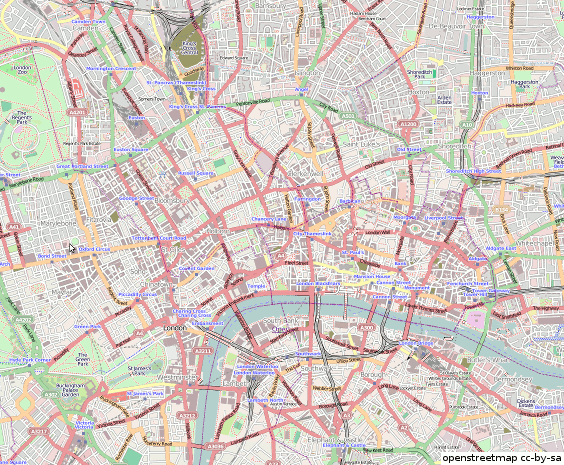
- The red bits show building coverage so far. There's a fair bit, but it's in uneven blotchy patches. When zoomed in, the patchiness looks very ugly.
- The main priority is to fill in the ugly gaps in the city centre, as illustrated by the first pink areas appearing
- After that we might try to round off the area of coverage into a cohesive blob
- After that it would make sense to extend it Northwards to meet with Blumpsy's blob
As if animated gif's weren't evil enough, how about a slideshare presentation? (well at least I didn't try to embed it here) This can be viewed fullscreen and it covers a larger area. Plus you can control it.
So what's the big idea? Well I wrote about London building outlines here and here and again more recently. So I just thought I would draw out my grand master plan
...of course ...it's not going to actually going to happen like that. This would be too much like "coordination". But no harm in trying hey?
I plan to fill one of these priority building gaps at the next mapping party on Fleet Street Tuesday 25th. But if that kind of mapping doesn't grab you, then there's plenty of shop POIs to add along Fleet Street (sign up for one of the slim cake slices). If that doesn't grab you, then just come to the pub! (Ye Olde Cheshire cheese again. It's a good 'un)
Discussion
Comment from Wynndale on 15 May 2010 at 16:30
If you find building outlines iin Yahoo hard to follow you can try StreetView, which isn’t really any worse. Of course there’s much better aerial photography if you’re mapping Surrey…
Comment from Harry Wood on 17 May 2010 at 11:16
Yeah there's some new building outline patches sprouting in Surrey now: http://twitter.com/Chobhamonian/status/14148838844