Background
The following assertion was made by a blogger around 18 months ago:
"..mappers as a whole are mapping more features (buildings, houses, libraries, schools, green spaces etc) within the wealthier areas of the Dublin region than in the poorer areas." {53degrees}
It was made here and in a follow up here
Reading the two posts together with the twitter promotions for them it is clear that the hypothesis rests on the perception that OSM contributors, specifically those contributing to OSM around Dublin, suffer from some kind of collective unconscious bias, to the extent that they have neglected the deprived areas of Dublin and mapped the affluent areas to a higher level of completion. This assertion, if well founded, would reveal that not only does the map of Ireland, specifically Dublin have gaps, - but that these gaps are patterned in such a way as to further exclude and marginalise the residents of these areas and the second blogpost makes no doubt of this consequence.
We have a great name for the band!: "The Spurious Correlations"
The author refers to 3 or 4 examples of poor areas, sparsely mapped, compared in turn to affluent areas mapped to a higher extent using visual assessment. There is no transparent methodology or apparent logic for these comparisons other than they were what the author appears to want to choose. Perhaps they are conveniently selected to suit the conclusion.
The author repeated the claim on twitter [now deleted] on the 23rd October 2020, presenting the evidence of these three or four comparisons as conclusive proof of a “startling lack of completion of working class areas in osm, a citizen science project”. Some charts were shown, demonstrating a very selective method of counting tags. Whether this represents traces of a deeper investigation remains unclear. This needs to be tested here and now.
Transparent Method
An inquiry with some more rigour than the two blogposts is much needed now. The first step is to refer to the deprivation index available here, and identify 10 outlier electoral divisions that are the most affluent, and 10 outlier electoral divisions that are most deprived1. If the assertion holds weight it should be detectable at the outlier values.
The ED boundaries were downloaded from the CSO website and the deprivation index was downloaded from the Irish Government’s official data portal and matched to these boundaries to enable comparison2.
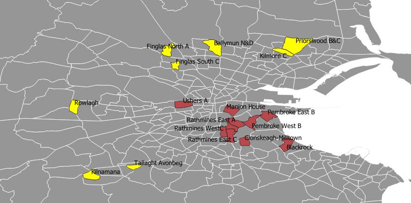
The OSM data was extracted as a .pbf tile from Geofabrik on the evening of the 23rd October and parsed in a PostgreSQL database to exclude areas outside the boundaries of the electoral divisions. Three queries detected the three types of object geometry which is what the blogger’s assertion rests on and simply counts them. A fourth query detected In the case of ways and relations it included those that were partly inside the boundary3.
The calculations are simply the aggregate count of all types of objects, further aggregated into an affluent total and deprived total, and then divided by the size of the area to fairly reflect the fact that the areas vary from 1.06 square km (Avonbeg) to 5.96 square km (Priorswood).
The Result
Let’s get down to it…
The first result produced is a count of all objects in the 20 extreme affluent/deprived areas, grouped into those categories, aggregated and normalised by the area size of the total electoral division area. Ultimately this counts and compares the density of mapped objects in the two groups of areas
| |
Affluent EDs objects per Sq KM; |
|
|
|
|
Deprived EDs objects per Sq KM; |
| |
696 |
|
|
|
|
1,173 |
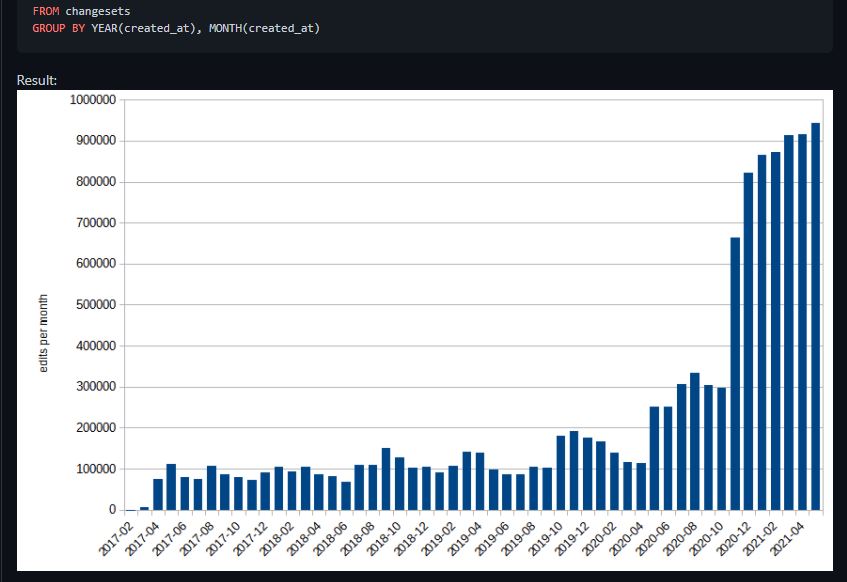
This result disproves the blogger’s conclusion about deprived areas being neglected by mappers. I will provide a separate diary post showing changeset dates to demonstrate that from 2016 a big upturn in mapping of Dublin’s deprived areas took place, and a rationale for why that began to happen, but that is for another day. And now for the tagging depth result…
| |
Affluent EDs Tag3+ objects per Sq KM; |
|
|
|
|
|
Deprived EDs Tag3+ objects per Sq KM; |
| |
652 |
|
|
|
|
|
186 |
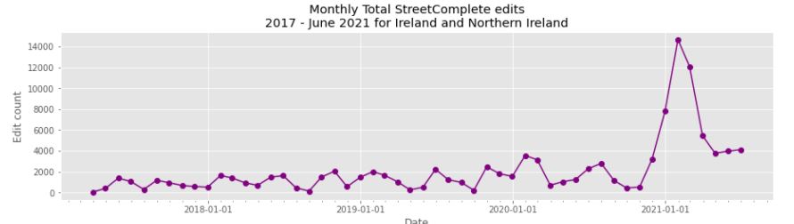
This shows that the affluent areas, though having less object geometry are tagged in somewhat more depth and detail. The figure may be skewed by two of the Affluent EDs which has peculiar characteristics, these are Mansion House and Rathmines East. The former has several city centre streets with specialised Government and Commercial services, however the latter is mainly suburban with a few shopping districts. This does support a totally new hypothesis of more nuanced mapping effort in Affluent areas, but more nuanced does not mean more “complete” as the original blogger’s claimed. The ages of the changesets suggest the original object geometries were typically provided around 2010-2012, and more osm contributors using on-the-go editors like StreetComplete, Vespucci, maps.me and OSMand.
Conclusion
These results, despite the finding of more detailed tagging in the affluent areas, do not support the main hypothesis that Dublin’s socially deprived areas have been deprived of mapping. It would appear that the mapping for these areas is at a higher level of completeness and will be easily converted into tagging depth.
There is nothing in the original idea that provides much insight into either the OpenStreetMap community and its mapping preferences, neither is there much to increase the cause of Dublin’s deprived neighbourhoods. A further diary entry will deal with some of the extraneous claims and wrong assumptions made, but that is for another day.
Footnotes
-
This is an outlier comparison often used in large datasets to eliminate “middle to middle” statistical noise. Twenty areas were chosen to increase processing speed. ↩
-
Neither dataset was uploaded to OpenStreetMap since they do not have compatible licence. The analysis was done in QGIS. ↩
-
DeBigC is grateful for the support of Rusty Broderick, who mentored me through PostgreSQL six years ago, and patiently ran the database queries to correct counts ↩