Quantifying HOT participation inequality: it's complicated.
Posted by dekstop on 26 October 2015 in English. Last updated on 27 October 2015.Pete asks:
On a skype today, Kate Chapman said that analysis after the earthquake in Haiti, she found that ‘40 people did 90% of the work’ within the community.
Is the workload more evenly spread throughout the community when it comes to Missing Maps tasks as opposed to HOT tasks? Is it more evenly spread during non-emergencies?
I thought I can look at this quickly because I’d done similar work around participation inequality in the context of OSM; in the end took much longer than expected and I can’t see that I found a simple answer. If anything it serves as a good reminder why it’s challenging to produce meaningful statistics for social spaces: the devil is in the many nuances. This writeup here can probably give you some impression of that.
Unfortunately I don’t have contributor statistics for Haiti since it predates the tasking manager, instead I will compare Missing Maps with other large HOT initiatives, most importantly Typhon Haiyan in the Philippines in 2013, but also the Ebola activation in 2014, and Nepal in 2015.
The impatient can skip the more in-depth discussion and jump to the conclusion section at the bottom. Note that this is just a quick exploration, not a thorough statistical analysis. I’m sure I’ve overlooked things, so please give feedback.
As usual I’m looking at labour hours as a measure of work. The results are probably not that different than if I’d used map edits, however I find they’re a better reflection of the effort spent on contributing. Time moves at the same pace for everyone, while the same number of clicks could yield a different number of edits depending on what you’re doing. Edit counts are also a potentially confusing measure because there’s no standard way of counting them: as the number of version increases of geometries, or the number of changesets? Etc. So here’s a key limitation of these stats: I’m not actually looking at map impact, instead I’m looking at a measure of individual effort.
You’re of course welcome to do your own analyses and compare, the raw data is linked below. Including edit counts!
Group sizes and average labour hours
Just to get a first impression: how much work do people do in each group, on average?
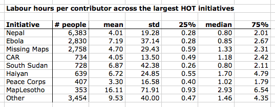
I apologise for the messy table, this is quite unreadable, but useful for reference later. According to my contributor database (which atm has data up to early August 2015) there were about 6,400 contributors to Nepal, 2,800 to Missing Maps, 650 to Haiyan, etc. In other words, Missing Maps has more than 4 times the number of contributors than Haiyan.
Here the median labour hours per group as a plot:
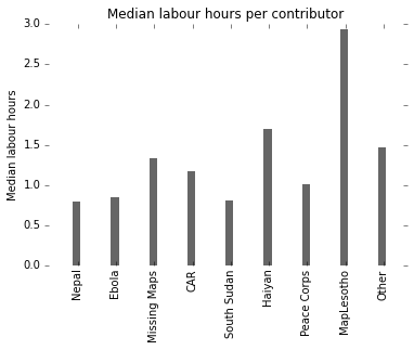
The median contributor effort looks comparable between Missing Maps and Haiyan. However bear in mind that we’re looking at a data set that is long-tail distributed, as this histogram suggests:
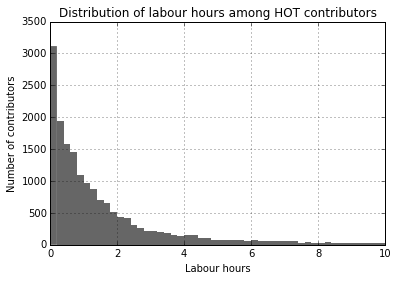
When looking at long-tail distributions we have to pick our aggregate measures carefully: the mean and even median are likely heavily skewed by outliers. There is no general measure of central tendency for long-tail distributions, nor can there be one. Repeat after me: “There is no average user”.
Instead we should compute measures of distribution: how is work distributed among the group?
The Gini index as a basic inequality measure
The Gini index is a classic measure in economics used to describe inequality in groups, usually income inequality in societies. It’s typically a number between 0 and 100 (sometimes 0 and 1), and a higher number means “more unequal”. According to the CIA fact book, the US has a Gini index of around 45 while the UK’s is around 33, and Germany is at 27.
The Gini index is also sometimes used to describe participation inequalities in online communities such as HOT. Online communities tend to be highly unequal, with a small share of highly active users; we will come back to that in a bit. It’s important to know that we can’t compare Gini scores across different kinds of social systems, e.g. we couldn’t fairly compare Wikipedia scores with HOT scores unless we’re sure they’ve both been measured in the same way. We can however simply use it to compare different subgroups within a community. Here: different HOT initiatives.
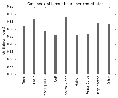
Observations: Missing Maps & Haiyan seem fairly similar. Haiyan might even be a little bit more fairly distributed, however these kinds of “social” statistics tend to be messy in all kinds of ways, with a high degree of measurement error, so for practical purposes I would consider them equal. Work for Nepal and particularly Ebola on the other hand is more unequally distributed – with either a smaller number of hardcore contributors, or a larger number of people who do very little.
Distribution of work: the bottom end
Ok so let’s look at the actual distribution of contributions – as a first step, let’s see how many people do a minimum amount of hours in each group.
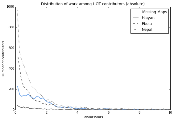
This plot shows the distribution of work in absolute terms: how many contributors work for x hours? For example we can see that in the Nepal and Ebola groups, a large number of people contribute very little: many already stop within the first 30 minutes. Missing Maps on the other hand has a nice bump: many people contribute for up to 2h. Is this the mapathon bump?
The Haiyan group is too small to be easily discernible in this plot, so let’s look at relative numbers..
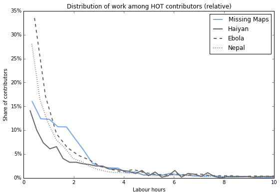
… it’s somewhere in between. Not an extreme spike of early leavers, but also no mapathon bump. Otoh it likely has a longer tail: a larger number of highly prolific contributors who each do loads of work.
Based on these charts you could say Missing Maps manages to raise the lower threshold of participation above the bare minimum, which is an achievement in itself. However this doesn’t yet answer Kate’s question: how much work do the top 40 contributors do?
Impact of highly prolific contributors
As we’ve seen in the summary table above, the initiatives have very different sizes. Based on that alone we can expect that the top 40 contributors in Missing Maps are likely to have had a smaller impact on the overall output, because it’s a larger overall group. Let’s check:
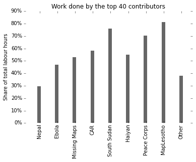
Hah, unexpected: The top 40 contributors in Missing Maps and Haiyan had about the same impact on their groups, both carry around 50% of the total effort! Intriguing. If I may speculate about a cause: Missing Maps is a larger project, but also has been running for much longer, so while the overall output is larger, the top contributors also have more time to do their share. (There’s only so much time in the day a person has available to do mapping.)
[NOTE: Kate said 90% for Haiti, I got 50% for Haiyan/MM for the same number of people. Why? Don’t know – don’t have data on Haiti, and would also need to compare how each statistic was computed. Stats are hard.]
Let’s look at it in relative numbers instead – the impact of top 6.25% contributors (the equivalent of 40 in 639 contributors for Haiyan, according to my records).
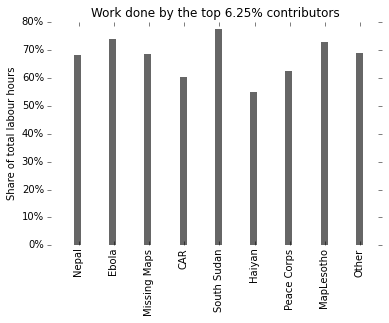
As expected: we’re now covering a larger absolute number of Missing Maps contributors, and of course they collectively account for a larger share of the work at almost 70%. I.e., the “core” contributor group in Missing Maps is larger and does more work than in Haiyan, but only because Missing Maps involves many more people.
Let’s also look at the impact of the top 20% contributors, just because that’s a classic number people tend to use.
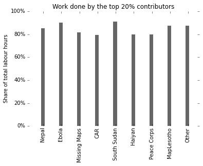
Here we see a classic 80-20 distribution: 20% of users are responsible for 80% of the work. Aka the Pareto principle. Widely observed among online communities. Interesting that it seems to approximately apply for every single one of the HOT initiatives shown here.
Conclusion
As in all things relating to people it’s complex, there are different ways of looking at the question, and likely many contributing effects: how were the initiatives promoted, were they executed by a core community or lots of one-off contributors, to what extent did they attract hardcore OSM experts, how long did activity last, etc. I think we barely scratched the surface here. It also serves as a good reminder of why we should be sceptical of simple analytics when looking at online communities.
Based on the charts here we could say that:
- Work is always “unfairly” distributed in HOT – that’s also a well-known empirical finding in many other social settings.
- Missing Maps and Haiyan (and other initiatives) are comparable in terms of participation inequality in some respects, however there are also differences.
- E.g. most have a similar 80-20 split, where 20% of highly active contributors do about 80% of the work – typical for online communities. This appears to be independent of group size, length of activity period, and other factors.
- It gets even more extreme at the top. A very small number of the most active contributors might be responsible for a surprisingly large share of the work – e.g. we found for both Haiyan and Missing Maps that 40 people are responsible for about half the work.
- Ebola and Nepal have a higher Gini index compared to Missing Maps or Haiyan, which means work is more unequally distributed in these groups. We find that in these two groups, a larger share of contributors drop out within the first 30 minutes – more people do less.
- Missing Maps on the other hand appears to have raised the bar in terms of minimum participation. Compared to the other groups we looked at, people don’t tend to drop out right away, and instead many stay active for 2h or more. This might be a result of the regular mapathons organised by Missing Maps teams around the world, or of the fact that it’s a long-running effort so people contribute more over time.
My inner academic would further argue that in order to gain confidence in these claims we’d have to do actual statistical analyses, and not just look at charts and summary statistics. For long-tailed distributions we might use statistical tests of independence, such as the Mann–Whitney U test or the Wilcoxon signed-rank test, to determine whether these distributions of labour are actually statistically different across the different groups. That’s for another time – or maybe someone else wants to take it on? The data is linked below.
Do any differences relate to a sense of urgency? Not sure we have looked at enough evidence to answer this; of the four groups we could say Haiyan & Nepal are “urgent”, Missing Maps is “not urgent”, and Ebola may be somewhere in between. I believe the data we’ve looked at so far won’t easily accommodate simple interpretations. A study for another day, or another person :)
Other suggestions for analyses not shown here?
The data used for these analyses:
- hot_contributors_20150810.csv (682kB), a list of all contributors per initiative, along with their total number of labour hours and edits.
Discussion
Comment from SimonPoole on 26 October 2015 at 18:19
The original question was
Is the workload more evenly spread throughout the community when it comes to Missing Maps tasks as opposed to HOT tasks?
I’m of the opinion that “workload” cannot be interpreted different than actual contributions to producing a usable map. Given that, you do not answer the question. You do however, again, try to spin things so that missing maps looks better than it is.
Comment from dekstop on 26 October 2015 at 18:25
Simon, I would love it if you took the data I linked above and published an “unbiased” version!
Comment from SK53 on 27 October 2015 at 12:53
I miss the detail of how you derive the labour hours for contributors. If I edit offline in JOSM and do not sign-up via the Tasking Manager how do you know how long I spend on my edits? Many experienced contributors to OSM will tend to prefer their personal workflow to that imposed by TM.
Other well known factors contributing to these phenomenon in extreme citizen science (following Hakaly’s terminology) activities are:
I suspect that on-the-ground experience cuts both ways: it eases interpretation, but at the same time inhibits mapping stuff known to be more complex than imagery allows.
Comment from dekstop on 27 October 2015 at 15:25
(After a long IRC conversation in the #osm channel with SK53 and others.)
At some point I’ll write a dedicated post about how I produce the data, people ask about it quite regularly. This should then also clearly state all the aims and known caveats of my methods – atm this is too dispersed over too many places, and whenever I write a new post I tend to forget to mention some of the many necessary disclaimers, which means sometimes people misunderstand my intentions. I’ll put down a few key points here so I can then later extract them as a dedicated post…
I’m posting these explorations on my diary to share my findings, but also to stimulate debate – about the HOT community, but also about the methods I use to describe the community. I’m always grateful when people are engaging with my posts and giving specific feedback, because such exchanges tend to involve learning experiences. Sometimes we can clarify misunderstandings, or people might identify gaps in my methodology, and sometimes we just find that people might interpret the same thing quite differently. As long as everyone stays constructive all these things are fair game, and I embrace being challenged. I love learning new things!
My main motivation to do any of this is to better understand how volunteers engage with HOT, and by HOT I mean “mapping projects using the tasking manager”. I’m not looking at map quality, or impact on the map, but instead at community engagement and volunteer effort.
The process of how I derive “labour hours” is broadly described here, and in some other places all over my diary: https://www.openstreetmap.org/user/dekstop/diary/35271#comment31077
The paper that first introduced the methodology (by Stuart Geiger and Aaron Halfaker) is concerned with contributor engagement in Wikipedia: http://www.stuartgeiger.com/cscw-sessions.pdf
My source data are the edits in the OSM edit history: any creation or version increase of a node, way, or relation, along with their timestamps. I cross-reference these with TM2 project bounds and activity periods. You do not need to be listed as a HOT project contributor to be considered for my analyses. I’ve found in informal checks that JOSM tends to preserve edit timestamps even when you submit edits in large chunks, however I do not sufficiently understand the mechanics to be certain.
Validation work is unfortunately not captured well by my statistics, because I have no visibility over their process and can only see actual map edits. This is important to acknowledge because in some HOT initiatives, more experienced contributors are encouraged to become validators. Depending on their process this might mean that they stop contributing to the map, and won’t show up in the OSM edit history – which mean they won’t show up in my stats. (On IRC SK53 says that his validation work for Missing Maps involved lots of map edits – “lots of crooked buildings”, and hence my stats probably captured his effort well; this will not always be the case.)
And finally – I still hope that someone actually takes my data set and does something entirely different with it :)
Comment from vtcraghead on 27 October 2015 at 15:57
You might address this elsewhere, but your participant count for Haiyan is far too low. Is it possible that 60% of the changeset-flagging participants didn’t use the task manager for that activation?
Comment from jonwit on 27 October 2015 at 16:16
This is tremendous
I did a quick pivot table on your dataset and calculated how many 8 hour workdays each project would take. Nepal has 1,067 work days by 6,383 people. That’s 3 years of data added!!
Comment from dekstop on 27 October 2015 at 16:30
vtcraghead – thanks for that link, it’s always useful to have comparative data sets.
Pascal gives some details about his process here: http://neis-one.org/2013/11/typhoon-haiyan-osm-response/
It looks like he’s looking at a much larger activity area, namely: “the Philippines and some parts of the Vietnam coast. This extent is illustrated by a black line on the website.” In comparison I’m only looking at project bounds within the tasking manager of any project that has “Typhoon Haiyan” in the title – 27 of them, all in the project ID range between #338 and #392.
Furthermore he’s looking at a longer time period than I am: many of these projects stopped receiving contributions via the tasking manager before year’s end, whereas his contributor number looks at the full period up to 1 Jan 2014.
https://wiki.openstreetmap.org/wiki/Typhoon_Haiyan has some details about the many mapping activities that took place outside of the tasking manager.
In short, he’s looking at a much wider range of activity whereas I’m only looking at contributions that could plausibly be associated with the HOT tasking manager. However the boundary between the two however are sometimes blurry, and unfortunately there’s no solid method for identifying which specific edits are attributable to TM contributions… I aim to find heuristics that work across most TM activities, and I’ve been updating my methods as I learned more about the nuances, however the extreme case of Haiyan illustrates that there can still be loads of additional activity in the context of the same disaster event that I’m not considering. In some cases this is intentional – e.g. for my analyses I explicitly do not want to include cleanup work that is organised outside of the tasking manager.
When I find some spare time I’ll have a look at the Haiyan contribution timeline to check whether I should update my heuristics – it certainly looks like I might, this is a big margin.
At minimum I should state this as a further disclaimer: there may be many activities around particular disaster events that I’m not considering because they cannot be attributed to tasking manager projects.
Thanks for posting this!
Stats are hard.
(As an aside – iirc Haiyan was way before changeset tags were widely used to annotate HOT initiatives, that only really became practical in mid-2014 when iD started supporting it.)
Comment from dekstop on 27 October 2015 at 16:33
Haha thank you so much jonwit – that comment made my day!
Comment from jonwit on 27 October 2015 at 18:15
The Long Tail distribution of the data-sets are crazy. All the projects depict a hoard of individuals with a few edits and a few crazy mappers. I put your datasets into SPSS and it looks like your charts seem to be exaggerating the few editors that completely skew my graphs. Its been a few years since my statistics class but maybe i can get a statistical test to run.
Comment from dekstop on 28 October 2015 at 14:10
Very nice! Yes I don’t show most of the tail in my distribution charts, that would have made it quite unreadable…
Comment from pnorman on 31 October 2015 at 00:32
I think referring to the workload spread as “unfair” is misleading. “Inequality”, although probably correct from a statistics point of view, is also a word that is associated with discrimination.
I’m not surprised to see power-law distributions. When I looked at overall contributor stats, changeset size, API reply size and several other measures, I saw power laws coming up.
Comment from dekstop on 31 October 2015 at 01:01
It’s a well-established term in social sciences: https://en.wikipedia.org/wiki/Participation_inequality
Comment from RAytoun on 8 November 2015 at 11:29
Thank you Martin, once again you are helping to make some sense out of this complex chaos. Agreed there are so many parameters that skew the figures but you do admit that this is a rough guide to what is actually happening and gives us a yardstick to measure things. Once a start has been made the figures can be more finely tuned as the data is refined.
What is becoming more apparent each time you produce stats is the following….. a] Newcomers that jump in and try to help during a crisis are far more prone to do just a few edits then drop out. My experience of this points to them setting out with meaning, finding it not as easy to do as expected (or not sure they are competent enough) and drop out. Many people are working hard on the LearnOSM (also translating it in to many different languages) and other ways to reach these beginners to help them to make sense of and gain confidence in their ability to help b] Mappers who attend Mapathons receive a basic training before starting and have people around to answer their queries. They go home with a great deal more confidence in their ability to add things to the map and many come back to Mapathons repeatedly for further contact and also help to move from iD to JOSM and validator training.
My conclusion and aim is to see Mapathons spread to more countries, cities, towns, universities as this will be the future pool of core mappers that will keep things moving on.
Keep the stats coming and helping us to help others.
Comment from dekstop on 8 November 2015 at 19:00
Many thanks for the kind words Ralph :)