Missing Maps: the first year in stats & charts
Posted by dekstop on 22 October 2015 in English. Last updated on 23 October 2015.Stats & charts I put together for a session at the Missing Maps powwow in Toronto (PDF)
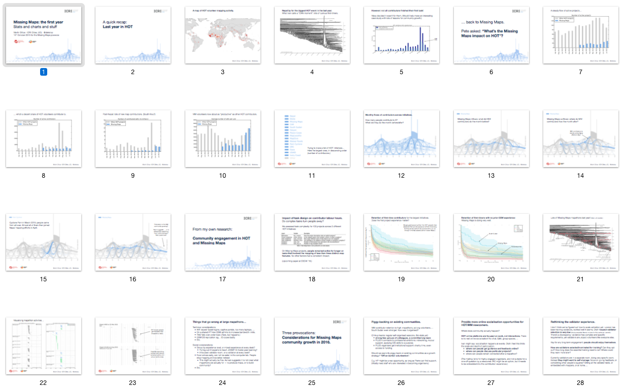
I had no time to prepare for this, so on the plane from London I simply went through my work of the last few months and collected things that seemed appropriate for the occasion. I intended this as a quick 30-minute review, but it ended up stimulating lots of debate throughout… so the session took 2h instead. For a conference setting this would have been disastrous, but since this was a team gathering it was actually quite useful. Data visualisation as conversational catalyst!
See also Dale’s recap of the powwow.
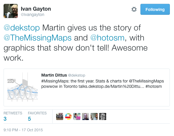
A few people sent me very nice thank-you notes when I later shared this online. My favourite compliment is probably Ivan’s reply on Twitter:
Immediately followed by Tyler’s note to the HOT list:
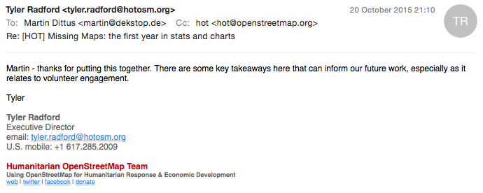
Thank you both! It’s good to know that the work resonates. It’s surprisingly challenging to design research projects that are academically strong and also of relevance to the outside world… As my supervisor Licia Capra likes to joke, academics like new methods while practitioners like old methods applied to new systems.
Discussion
Comment from dekstop on 26 October 2015 at 15:38
JIBEC asked via DM how I produced these visualisations.
I’ve written a little bit about the data side here:
The charts were mostly produced in Python with Matplotlib, using custom visualisation methods that I wrote myself. E.g. the contributor flow plot was a bank holiday project, it took a couple of days to get it just right…
The world map was done in QGIS, and the survival plots were made with the Python lifelines library: http://lifelines.readthedocs.org/en/latest/
I’m making heavy use of IPython with inline Matplotlib charts for data exploration, they essentially replaced most other tools I might have used in the past. Plus it means I don’t have to use R! (No offence to R users, it simply doesn’t fit my mental model at all.)