US power lines are still incomplete
Posted by 42429 on 7 February 2011 in English. Last updated on 8 February 2011.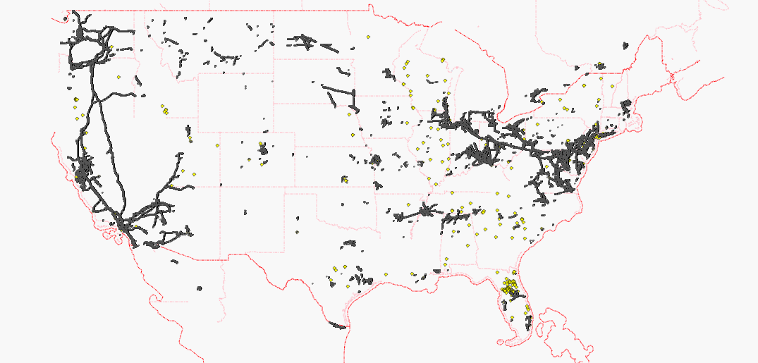
Each black dot represents a pylon, each yellow dot represents a substation node.
http://wiki.openstreetmap.org/wiki/WikiProject_Power_networks/United_States
Discussion
Comment from EdLoach on 7 February 2011 at 21:08
What does the image show? I have vague recollections of doing quite a bit of powerline/imagery stuff in GA, but the map there looks a bit sparse.
Comment from 42429 on 7 February 2011 at 22:03
Each black dot represents a pylon, each yellow dot represents a substation.
Pylons prove that a human mapper has mapped there because TIGER lines do not include pylons.
Comment from iandees on 7 February 2011 at 22:58
I know that I've mapped dozens of substations in the midwest with polygons. Are you accounting for those? How about full power stations?
Comment from 42429 on 7 February 2011 at 23:28
This map tries to visualize mapped and unmapped areas so that interested mappers can improve unmapped areas. For technical reasons, it does not focus on special features like power stations which are visualized in the following very detailed map:
http://energy.freelayer.net/?zoom=8&lat=52.56802&lon=9.33476&layers=B00000
Rendering such a detailed map requires very good data (which is available for Northern Germany) and very much processing power.
The map above is a very rough sketch in order to start a discussion about power mapping quality.
Comment from 42429 on 8 February 2011 at 00:27
Update: there is also another powermap which covers the United States:
http://toolserver.org/~osm/styles/?zoom=12&lat=40.81767&lon=-74.21297&layers=B000F0FF0000F0FFF0000T
Comment from EdLoach on 8 February 2011 at 08:45
Thanks for answering my question. There is a chance I didn't add the pylons as I was using Potlatch at the time to cover the large areas involved; with JOSM I'd have traced the lines and then used a search for "child selected" to add the pylons. Perhaps I should revisit the areas, if I can remember where I was mapping exactly...
Comment from compdude on 8 February 2011 at 16:01
Boy, I didn't think it was that bad. There is a user in Washington State who has done quite a bit of mapping powerlines, zephyr. He is the reason it looks so darn good. I should get him to take a look at this.
Comment from zephyr on 8 February 2011 at 19:33
Thanks to compdude for pointing out this discussion. As he mentioned, I've been working hard in Washington state, but there is still so much left to do. It's nice to see the map above:
http://toolserver.org/~osm/styles/?zoom=9&lat=46.72759&lon=-119.12371&layers=B000F0FF0000F0FFF0000T
But, in this view of the map there are several wind farms that aren't shown, and I believe a couple dams (power_source=hydro) that aren't shown either.
I think one of the main stumbling blocks I've had is visualization, so that I can see where I need to work still.
Does anyone have any suggestions on usable sources for line voltage?